I received some audience feedback for my Ancillary Task 1 – Poster. I showed the audience my 3 mock up posters and let them decide which one they liked best and which one they didn’t like as much and what I could improve.
This is what I got from their responses:
Positives:
They liked the third poster mock up idea which was the one with arches with the pathway. Which is good because it’s my favourite mock up.
They like how I linked in the colour red from the film to the mock ups- mainly in the third mock up with the red flowers on the right side of the poster and the title ‘RECLUSE’.
How the third mock up poster linked in well with the setting of the film.
Liked the idea of the second mock up.
Negatives:
The third mock up, the title blends into the mud with the red- so therefore I need to put a stroke on the title to make it stand out more- but this was the only negative form this poster.
First and Second mock ups aren’t setting related to the film. As the film doesn’t include a lake.
Second mock up- looks like a documentary style poster- rather than a film poster.
Second mock up- the title at the top of the screen doesn’t stand out and isn’t visible to read.
This is my third and final mock up idea for my poster. This is also my personal favourite out of all the three mock ups. I like the photograph originally and I feel that by layering the text on top of the photograph has only improved the idea of making it into a poster. I really like how the red is involved, like the leaves on the right hand side of the photographs and the red title as the colour red is a main element in my film so by linking it in with the ancillaries shows that I am incorporating the idea from my film into my poster and magazine. I have done some audience feedback and this will be uploaded in a video as I have filmed this. However, there was one thing that they wanted me to improve and that was the red ”RECLUSE” title, as it blends into the mud at the bottom of the image. It wasn’t a lot that I needed to change, all I had to do was put a stroke on it making it stand out more, I will do this and upload the improvements made to it and this will be my final Poster. The demographic decided that they liked this poster the most out of all of the mock ups so with the improvements will be my final poster.
Final Mock Up Idea 3 (Red Title)
This is the exact same poster but with the ”RECLUSE” title in a white colour. I saw that the red blended into the mud so I was experimenting with colours to see what looked better. I still think the red is better but I will have to put a stroke on the lettering to make it stand out, as I think that the white lettering doesn’t look right because the other letting in this poster is white, this is why I am not going along with this idea of the poster. I thought I’d better include it in my blog, as this way I can say what I didn’t like about the alternative poster. I also got my demographic to look at it to see what they thought about it and they also didn’t like the amount of white font on the poster which is why I voted against this idea.
Final Mock Up Idea 3 (White Title)
This is the original image that I have used for my main image. I liked the image before I added the font which is why I knew it would look good as a poster. I took this photograph whilst I was in the filming process, this was the photograph that stood out to me as it was taken in the setting where we were filming which makes it a good idea to use as a poster idea. I also like the idea that it doesn’t include any characters in it so therefore it makes the audience wonder what the film is about.
This is my second final mock up idea, this is my second favourite poster idea out of them all because it provides very little information. From audience feedback I have found out that they feel that this poster would be more effective if it was for a documentary because of the way it’s laid out and the idea that it doesn’t show much. However, as a poster they also agreed that they liked it based on the image and the way the bottom part is laid out in the poster. They also said how they liked the colour of the main title ”RECLUSE” as it links in with the film as the main colour that I focus on in the film is red. (red flowers, red ribbon and red perfume bottle). The one thing they didn’t like was the red lettering at the top of the poster which they would have preferred to be in the white font as you cant really read the top writing. This will all be shown in a video that I have made where I am filming the audience feedback for my work.
Final Mock Up Idea 2
This is the original image that I edited previously, I have cropped this image as well like I did in the first mock up idea, just because it was horizontal and I needed it vertical for my poster idea. I like how the details in the wood stands out against the water and I like how the reflections in the water stand out. Also I like the simplicity as the image doesn’t give anything away about the film, it doesn’t show the character so we as an audience dont know who it is, it also doesn’t show much for setting accept that it is something to do with nature.
This is my first final mock up idea for my poster. This is my least favourite out of the three and when I got the audience feedback they agreed that this was the weakest of them all. This is because the image is washed out and the figure blends into the background rather than stands out which is what I wanted. Also the setting isn’t relatable to my actual setting of the film. However, I do like how this poster has turned out, the setting is based in an atmospheric forest that was very damp and wet when we were filming so I felt that because the background image was a lake it linked in well with the setting idea of nature therefore, I thought it would turn out well. I personally like the image and how it has turned out, I would have changed the font as it looks less professional but I do like how the credits and the bottom part of the poster have turned out and I feel that this has come out successful so therefore I have put this element on every single poster as it has been the best part of the poster.
Poster Final Mock up 1
This is the photograph that I edited beforehand, I have cropped the image so that it was vertical rather than horizontal, as the horizontal image looks like it should be placed in a magazine article rather than as a poster. I feel like the image personally is a lot darker than I would have wanted on the right hand side, but I like how effective it looks and the reflections in the water.
For my final Poster idea I wanted to use a photograph that I took when I was filming. I took some setting photographs that I really liked and this was my favourite out of them all. I think it makes a great poster image after I edited it. But even unedited I really like the photograph. I think because it’s a narrow pathway with the tree branches intertwined making it look spooky, that it really creates a horror atmosphere.
Original Image
I was surprised when I took this photograph that it came out a lot better than I thought. The other pictures I took came out blurry, or washed out. That’s why I preferred this image. I thought it would look good as my poster idea as it is vertical and I like how it is framed with the pathway central of the image. I personally like how the contrasting turned out before I edited it, however I wanted to get a more sinister effect to the photograph making it generic to the horror/fantasy film genre.
Edited Image
This is the edited photograph of the image above. I really liked how it turned out, I think that since this image I have enhanced the brightness because in the poster it looks a lot brighter. This is personally to dark as a poster idea, I think if I was to improve it I would decrease the contrast a bit more making it look more realistic. I have used the paint tool on vivid light effect to make the corners and the foreground of the photograph darker, further creating the eerie effect that I wanted. I like how the low level of green is enhanced in the image as in my opinion I think it shows the gradient from darkness in the foreground to a lighter colour in the background only improving the effect. Also when increasing the contrast the leafs on the right hand side of the photograph has stood out against the black colour exaggerated in the whole image. Showing the little colour that is enhanced contrasts from the stereotypical antagonistic side and the innocence of the protagonist/damsel in distress, which in my opinion exaggerates the idea that the antagonist character will always be more powerful than the damsel in distress.
For this Poster Planning I have decided to choose a second poster idea that I would like to make as a final poster. I liked this photograph because I didn’t expect it to turn out as well as I thought it would. I personally didn’t think it meant much because it doesn’t show much. However, then I came up with the idea that this image could in-fact be interesting as an poster because it keeps the audience intrigued into thinking what it could be about as it doesn’t give anything away.
Original Image
I personally like how it doesn’t show much because it lets the audience interpret what they want from the poster as to what the film will be about. It also gives across the fear of the unknown feeling, which is what I like seeing as it’s based on the horror genre, and as long as the poster gives across the idea that its in the horror genre. I wanted to incorporate the knee-high boots as it creates the illusion that this is the antagonist character, as she is all in black and that creates a negative effect, but as an audience you dont know whether the person shown is the antagonist or protagonist as there is not hints to either character. I did end up cropping the image for my final poster idea as I preferred it more vertical than horizontal, it also let the typography fit in better.
Edited Image
This is my edited photograph that I edited on Photoshop. Now I have edited the photograph it relates to the horror/fantasy genre more than it did in the original photograph. I decided to use the contrast and brightness tool in order to darken the wooded area and the boots, also to create the black indents within the image, I decreased the brightness making it more eerie looking as it would be a stereotypical convention of the horror genre. I used the gradient tool, which creates the foggy washed out look. I like how effective this looks because it creates the darker shades at the bottom of the photograph, slowly blending out too the water creating a lighter effect. The paint tool I used on the vivid light effect on 8% really makes the wood she’s standing on stand out and looks creepy and old. I used it around the corners and on the boots as well as the bottom edge of the photograph to make it look more 3 dimensional.
For planning to create my first poster final idea, I have decided to create this post as a way of showing my progress in creating it. down below is a before and after image of my main image I have chosen to use for this poster, showing what it looked like before I edited it so that I can explain The steps I have made to create this final Poster idea.
Original Image
I liked how this image came out before I edited it, all it needed was for me to make it darker and suitable for my genre of film, which is the thriller, fantasy, adventure genre. This would imply that the poster needs Gothic conventions as it would then create the suspense and scary atmosphere so that my demographic would be able to easily identify it with the genre of film, therefore making it intriguing to the eye, drawing them in with it.
I went to Tilgate Park with my Friend Megan who isn’t the actress in the film, however this didn’t matter because all I wanted was a silhouette. I could easily edit the silhouette which I did below, on Photoshop, therefore this wasn’t a hard task for me seeing as I am used to the editing software, due to me doing Photography at school as one of my subjects. I wanted to follow my mock-up plan where I found images on the internet as I liked how this idea turned out. The Poster turned out to be a lot different than I thought it would be however, I think that the improvements made to the final poster idea, only improves the quality of my work.
Edited Image
This is my edited version of the Photograph I took above. I really liked how it turned out, in the final poster idea I have cropped this photograph which I will show when I post the Poster. It looks much more professional cropped, However I wanted to show how I edited it first, I muted the colours by turning the saturation down, creating the spooky look that I wanted seeing as it’s a horror/fantasy film. I then brought out the blue tones in the water making the reflections stand out against the darkness monotones of the trees that I wanted to look old and tattered which is good that I took the photograph when I did as the trees aren’t growing leaves yet.
I used the gradient tool which creates the blended fog effect that I thought brings the image together, this is a key feature that links the photograph to the thriller genre, as when I was researching the genre the film posters were mainly monotoned and included fog as a conventional feature of horror films. Finally I used the paint tool, using vivid light on 8% to zoom into the person and black her out so she would look like a silhouette, i used the same tool to create the dark edges and corners of the images, alongside the contrast and brightness.
Out of the three mock-Ups I have made I like this one the most. I feel that this one has reached the professionalism that I wanted for the a teaser poster. Obviously these are my images, but I want to try and replicate the images above to create a similar poster. I like the fact that the woman in the image above was digitally manipulated in, however you wouldn’t be able to tell as it looks like she is supposed to be in the image. I like the monochromatic background because it creates a negative feel to the image, this is what I would like to achieve in my final poster due to the fact that it creates the thriller vibe. I also like the idea that it’s sticking with the natural background picture, even-though it’s not woodland is still think it creates the same effect.
I still like the idea of red lettering for the main titles for example the ”Recluse” film title. As I feel it draws the attention of the audience to the lettering which is where they will notice what the film name is. I think by choosing a black and white backdrop, emphasises the red lettering making it stand out, which is juxtaposed showing what the film will be like. I feel that because the woman is looking out and you can only see the back of her it indicates that ”Recluse” meaning seclusion and separate from others which is what I want to put across seeing as she is secluded, the fact we cant see her face shows she doesn’t want to be seen.
This was the original image of the woman it was easy to manipulate into the background image below, because it has a similar background therefore the outlines of the woman was easier to get a copy of her onto the background I had chosen. I liked the fact that she was turned away because it shows the fact that she could be the protagonist because she is scared and looking out at the water of in fact she could be the antagonist because she doesn’t want you to see her face as it will reveal her identity, she is looking out on the water to show that she is plotting a plan. Therefore, it keeps the audience wanting to know what and who she actually is, this is a key convention of thriller films- you never know what to expect.
I decided to chose this background because I wanted to keep with the idea of nature as the film is set in the woods which is a natural setting. I also love the images of rivers and ponds as it doesn’t give anything a way which is what I wanted to portray. I also like the monochromatic background as it’s a sign of negativity, yet it’s bright enough to show something.
I decided to incorporate the stars into this post because even though they are a small element of the image above I think that they were the hardest part to digitally manipulate into the image. Even-though they look like they are just plain stars they are on a white background and they have a reflection. I had to remove these parts just revealing the stars then layered them and copied them onto the poster.
This is my second mock up, using pictures from the internet to demonstrate where I will place my final elements on the poster. I tried to pick my photographs so that they would link in well with my theme and similar pictures that I would actually like to use in my final designs. I edited this on Photoshop so that I could layer on the images of the woman in the foreground and the small silhouette in the background in the bottom right corner. These images were taken from separate photographs, however I did want to include a woodland background seeing that our film is being filmed in the woods. This will help identify the audience with the genre and where it is set.
I decided to go with the red lettering as it infers danger, which is what I wanted to put across as the protagonist faces danger. I also liked the font because it wasn’t too serious but at the same time wasn’t childish so it becomes believable in a thriller/fantasy genre. I believe I could improve the poster by looking into the small details but I wanted to go down the route of a teaser poster rather than an official poster as it keeps the audience wanting more. I also thought that it doesn’t need all the credits at the bottom of the poster, because there simply isn’t enough people to credit so it would be lacking realism.
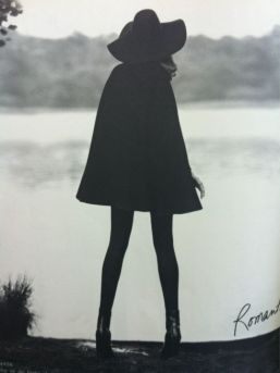
I decided to chose this image because I liked the way it was a silhouette, however she has this confidence to the way she is standing, she is also wearing something that looks like a cape which is what one of my main characters will be wearing therefore I thought it would be relate able. It was easy to layer this woman out of this image and onto the other image because I have a good knowledge with Photoshop, therefore I knew it wouldn’t be hard to manipulate.
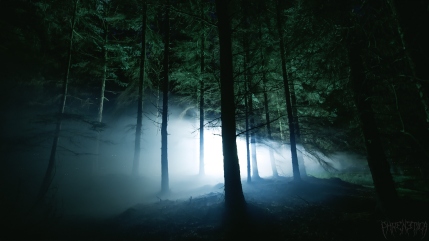
This image, I think is a powerful interpretation of the woodland area. I decided to chose this image because I wanted to get a spooky environment to portray the thriller genre. Considering that we are filming in a woodland area I thought that the setting should be the main background image to place the audience with the characters. The fact that this image is so dark made it easier to digitally manipulate the two characters from separate images onto the background, if it was a lighter background the outlines of the images would have shown up more making it look like they were from separate images. I feel that the two images layered on top look close to being in the picture due to the dark background.
This image shows an innocent persons face, with her body language it shows fear, which is what one of the main characters will be feeling due to the fact that she is trying to find her identity but whilst finding this person she thinks she is chasing she discovers something that creates fear for her because she sees a negative character. Also because the background of this image is dark, it makes it easier to remove the girl from the image and layer her on top of the background photograph, seeing as it is is layering onto a dark backdrop. I thought by having her in the foreground would increase the emotion top show the innocence being troubled, this creates a scared effect, and when researching the genre film posters I found that they had the protagonist in the foreground to show that there will be a victim.
This is my first attempt of forming a layout of a poster for my ancillary poster. I feel like this is my least successful Mock up and least professional as it was my first attempt. I like the colour of the title ‘Recluse’ because it stands out compared to the monochromatic background. I like the font of the other writing accept the main title which I think is childish and not scary or spooky at all, which is not the approach I want seeing as my genre of film is a thriller/fantasy/adventure film therefore I want it to be serious and spooky. I like the idea behind the creepy stairs and the woodland area seeing as we are filming in a woodland area, therefore the photograph is relate able to my setting of the film. I would also like to include some techniques that posters include such as; reviews from other magazines or newspapers at the top, directors names as well as the placement of certain elements on the poster.
I found this image on the internet and thought that it would be a perfect example to use in my poster. Seeing as my film has two main characters the evil and the good character, that this shadowed figure would make the perfect figure for the evil character. This creates the idea that you should ”fear the unknown”. Even her stance shows confidence which is what the villain is supposed to have. I used Photoshop to edit out the character from the background making it easier to create a layer and place the image of the woman onto the background below.
I thought this image that I found on the internet was a great example for my background image. This is because it’s a spooky setting, with the dark woodland area and the creepy stairs. This relates to where my film is set because it’s in the woodland area, and this image above is set in a similar surrounding. In the final image I have darkened this image so that it creates an creepy atmosphere which is great for a thriller genre film.