Good Typography for my Ancillary task 1 (poster) idea

I feel that this font is an appropriate font for my film poster because it’s relate-able to my genre which is the thriller/fantasy/ adventure genre. This particular font is more thriller than the others however it’s not childish or low quality in the way that it can be used to make a professional poster. This font is considered to be classed as a Horror font. It is commonly found in film posters that contain thriller elements such as ‘Humpty Dumpty’ as it creates a eerie element to go alongside the picture which will also be creepy. Like in the poster for Humpty Dumpty as it has some creepy gremlin peering through a crack in the wood.
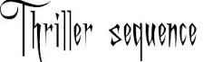
I think this font type is good as it’s written in a line and not different sizes and off the line, like the lettering above. This creates a more sinister effect which I like because it’s intriguing for an audience. It’s also not too playful that it’s humerus and unrealistic. I want to make my poster realistic and serious looking with an element of questioning, so it leaves the audience wanting more. This font comes under the font types as a Horror font, it is most commonly found in film posters such as ‘ The Walking Dead’ accept the font used for this film is slightly more pigmented and in line.
This type of Typography is a different style to the fonts above. This is because the typography above is more relate-able to the thriller/fantasy genre. This font is more adventurous and straight forward. I like this font the most out of them all, because it doesn’t give away much about the film. The black colour makes it look serious and bold, As well as the first letter of both words is larger than the rest of the text creating more depth. It’s simple but I feel it’s effective. This font is stereotypically found in fantasy films/ Tv shows such as ‘Once Upon A Time’ where it links in with the Fantasy and Fairytale genre. Also could be found in ‘Red Riding Hood’s’ poster title which is good because my film is relatable to red riding hood with its stereotypical conventions.
Bad types of Typography for my Ancillary task 1 (poster)
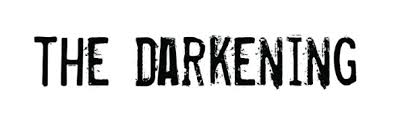
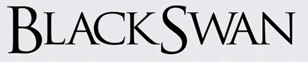
This font is inappropriate because it’s really thin and tight in the fact that the spacing between the lettering is very close. This creates a sinister effect, however it doesn’t fit with my genre as much as I would want for my poster. Therefore I will not be using this font for my ancillary. I think it fits well with a thriller genre film, but without any other genres generically blurred into one film, therefore it wont suit my work. This type of font is a stereotypical ‘horror/thriller’ font which would be suitable for primarily thriller films such as ‘Orphan’.

I like this font However I feel that this is too simplistic for my poster considering that I want my poster to represent the genre as well as the storyline. This includes the fonts even though it’s a small part of a poster it creates the perception of the poster, because if the poster had a font like this one above, I would relate this to a diary entry film, about someone’s life because it’s simplistic and doesn’t include an insight into the genre. This fonts simplicity would stereotypically link in well with simple documentary styled typography, I think that it would look good in headlines in the newspaper or magazines, for a more formal effect.
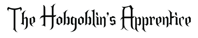
This typography is also inappropriate because it’s more adventurous in the genre element, it’s more stylistic and has the form of old English which would be relate-able to a film set in medieval times as it has the old look to the writing. It’s good for the fantasy theme, however my film is more thriller than fantasy or adventure, therefore I would need a serious font in order to create a realistic and a clear approach to the genre. This font is classed as a stereotypical Fantasy font, I would commonly associate this font with films such as ‘The Hobbit’, with its fantasy/adventure characteristics. I personally would relate this to a ‘wizard’ film like Harry Potter or Merlin.